Introduction
Combos are a way to group nodes in a graph. They can be used to represent hierarchical structures or to visually organize nodes. In g6R, combos can be created from a dataframe or a list such as:
combos <- data.frame(id = 1:2)

# or
combos <- list(
  list(id = 1),
  list(id = 2)
)
In g6R, the preferred way to create combos is by using
the helper functions g6_combo() and
g6_combos().
These functions provide a consistent and user-friendly interface for
combo creation, supporting both simple and advanced customization.g6_combo() allows you to define a single combo with
specific properties, while g6_combos() and
as_g6_combos() can generate multiple combos from various
input formats (data.frame, list):
as.list(methods("as_g6_combo"))
#> [[1]]
#> [1] "as_g6_combo.g6_combo"
#>
#> [[2]]
#> [1] "as_g6_combo.list"
as.list(methods("as_g6_combos"))
#> [[1]]
#> [1] "as_g6_combos.data.frame"
#>
#> [[2]]
#> [1] "as_g6_combos.g6_combos"
#>
#> [[3]]
#> [1] "as_g6_combos.list"
Using these helpers ensures compatibility with all g6R features and is the recommended method for combo creation.
For example:
# Create a single combo
combo <- g6_combo(id = "combo1", type = "rect", style = list(fill = "#FFD700"))

# Create multiple combos from a data frame
df <- data.frame(id = c("combo1", "combo2"), type = c("rect", "circle"))
combos <- as_g6_combos(df)
combos
#> [[1]]
#> $id
#> [1] "combo1"
#>
#> $type
#> [1] "rect"
#>
#> attr(,"class")
#> [1] "g6_combo"   "g6_element"
#>
#> [[2]]
#> $id
#> [1] "combo2"
#>
#> $type
#> [1] "circle"
#>
#> attr(,"class")
#> [1] "g6_combo"   "g6_element"
#>
#> attr(,"class")
#> [1] "g6_combos"

# With g6_combos()
combos <- g6_combos(
  g6_combo(id = "combo1", type = "rect"),
  g6_combo(id = "combo2", type = "circle")
)

# with a list
lst <- list(
  list(id = "combo1", type = "rect"),
  list(id = "combo2", type = "circle")
)
combos <- as_g6_combos(lst)
combos
#> [[1]]
#> $id
#> [1] "combo1"
#>
#> $type
#> [1] "rect"
#>
#> attr(,"class")
#> [1] "g6_combo"   "g6_element"
#>
#> [[2]]
#> $id
#> [1] "combo2"
#>
#> $type
#> [1] "circle"
#>
#> attr(,"class")
#> [1] "g6_combo"   "g6_element"
#>
#> attr(,"class")
#> [1] "g6_combos"
Data properties
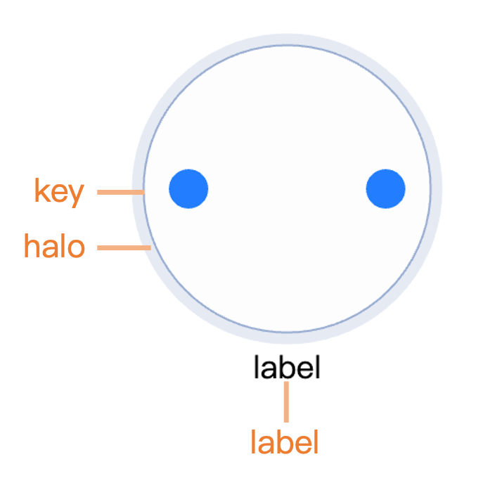
g6R combos are allowed to have the following properties:
-
id: a unique identifier for the combo, required. -
type: the type of the combo. -
data: custom data for the combo that can be retrieved. -
style: style properties. A comprehensive list is available here. -
states: initial states. An unnamed list of valid states. -
combo: id of the parent combo if any.
Combo types
There are 2 main combo types, circle and
rect:
combos <- data.frame(
  id = c("combo1", "combo2", "combo3"),
  type = c("circle", "rect", "circle"),
  combo = c("combo3", "combo3", NA)
)
nodes <- data.frame(
  id = 1:4,
  combo = c(
    "combo1",
    "combo1",
    "combo2",
    "combo2"
  )
)

g6(nodes, combos = combos) |>
  g6_layout(antv_dagre_layout()) |>
  g6_options(
    animation = FALSE,
    node = list(
      style = list(
        labelText = JS(
          "(d) => {
            return d.id
          }"
        )
      )
    ),
    combo = list(
      style = list(
        lineWidth = 2,
        labelText = JS(
          "(d) => {
            return d.id
          }"
        )
      )
    )
  ) |>
  g6_behaviors(
    zoom_canvas(),
    collapse_expand(),
    drag_element(dropEffect = "link")
  )
By using drag_element(dropEffect = "link"), you can drag
nodes into combos, which will automatically create a link between the
node and the combo in the graph data. We provide more examples in the
Shiny vignette (TBD).
Like for the edges, we implemented a custom combo type
circle-combo-with-extra-button, which adds a button to
bottom of the combo. This button can be used to collapse or expand the
combo:
combos <- data.frame(
  id = c("combo1"),
  type = "circle-combo-with-extra-button"
)

nodes <- data.frame(
  id = 1,
  combo = c("combo1")
)

g6(nodes, combos = combos, height = "200px") |>
  g6_layout(antv_dagre_layout()) |>
  g6_options(
    animation = FALSE,
    node = list(
      style = list(
        labelText = JS(
          "(d) => {
            return d.id
          }"
        )
      )
    ),
    combo = list(
      style = list(
        lineWidth = 2,
        labelPlacement = "top",
        labelText = JS(
          "(d) => {
            return d.id
          }"
        )
      )
    )
  ) |>
  g6_behaviors(
    collapse_expand(),
    drag_element()
  )
Styling combos
The g6 JavaScript library exposes a wide range of style
properties for combos, which can be set in the style
property of the combo data. We list below the most outstanding
properties, but you can find a comprehensive list in the documentation.
Main graphic properties
These properties are used to define the main graphic style of the combo that depend when it is expanded or not, such as color, width, and line type. They can be applied at the global combo option level or at the individual combo level. Here is an example of how to set the color for all combo of the same graph:
combos <- data.frame(id = c("combo1"))
nodes <- data.frame(
  id = 1,
  combo = c("combo1")
)
g6(nodes, combos = combos, height = "200px") |>
  g6_layout(d3_force_layout()) |>
  g6_options(
    combo = list(
      style = list(
        fill = "#FFB6C1", # Combo fill color
        fillOpacity = 0.5, # Combo fill opacity
        stroke = "#000", # Combo border color
        lineWidth = 2, # Combo border width
        collapsedFill = "pink",
        collapsedStroke = "pink",
        collapsedSize = 10 # Default is 32
      )
    )
  ) |>
  g6_behaviors(
    collapse_expand(),
    drag_element()
  )
Label styling
Some common properties include label styling:
combos <- data.frame(id = c("combo1"))
nodes <- data.frame(
  id = 1,
  combo = c("combo1")
)
g6(nodes, combos = combos, height = "200px") |>
  g6_layout(d3_force_layout()) |>
  g6_options(
    combo = list(
      style = list(
        label = TRUE, # Whether to display the combo label
        labelText = "Combo Name", # Label text content
        labelFill = "#000", # Label text color
        labelFontSize = 12, # Label font size
        labelFontWeight = "normal", # Label font weight
        labelPlacement = "bottom", # Position of the label relative to the main graphic of the combo
        labelBackground = TRUE, # Whether to display the combo label background
        labelBackgroundFill = "#000", # Label background fill
        labelBackgroundRadius = 10, # Label background corner radius
        labelBackgroundFillOpacity = 0.5 # Label background fill color opacity
      )
    )
  ) |>
  g6_behaviors(
    collapse_expand(),
    drag_element()
  )
States
Combos can have different states
that can be used to indicate different conditions or interactions.
States can be set in the states property of the node
data:
states <- c(
  "default",
  "selected",
  "highlight",
  "active",
  "inactive",
  "disabled"
)
combos <- lapply(seq_along(states), \(i) {
  list(
    id = sprintf("combo-%s", i),
    states = list(states[[i]]),
    data = list(state = states[[i]])
  )
})
nodes <- lapply(seq_along(states), \(i) {
  list(
    id = sprintf("node-%s", i),
    combo = sprintf("combo-%s", i)
  )
})
g6(nodes, combos = combos) |>
  g6_layout(d3_force_layout()) |>
  g6_options(
    animation = FALSE,
    combo = list(
      style = list(
        labelText = JS(
          "(d) => {
            return d.data.state
          }"
        )
      )
    )
  )
Color palette
g6(poke$nodes, poke$edges, poke$combos) |>
  g6_layout(combo_combined_layout(spacing = 50)) |>
  g6_options(
    animation = FALSE,
    node = list(
      style = list(
        labelText = JS(
          "(d) => {
            return d.data.label
          }"
        )
      )
    ),
    edge = list(
      style = list(endArrow = TRUE)
    ),
    combo = list(
      style = list(
        fillOpacity = 0.5
      ),
      palette = list(
        type = "group", # use discret palette
        field = "family",
        color = "spectral"
      )
    )
  ) |>
  g6_behaviors(
    zoom_canvas(),
    collapse_expand(),
    drag_element()
  )
Update combos data
These functions can only be used in a Shiny app context. They allow you to get or update the combos data in the graph after it has been created. The functions are:
-
g6_add_combos(): adds new combos to the graph. -
g6_update_combos(): updates existing combos in the graph. -
g6_remove_combos(): removes combos from the graph. -
g6_set_combos(): set combos state. -
g6_get_combos(): get combos data from the graph.
We provide more details and examples in the Shiny integration vignette.